chart recipes#
Common examples to start building charts with the visualization_toolkit.
Each tile below will have a different configuration of the chart function to display data.
Caution
Many of the code examples in these recipes include loading CSV data from pandas. This should not be used in production scenarios and is only done for the purposes of creating live code demos in the documentation.
Pass data to the chart function using pyspark dataframes in Databricks notebooks or using lists of dictionaries generated from DBSQL queries
via the execute_query function for data apps.
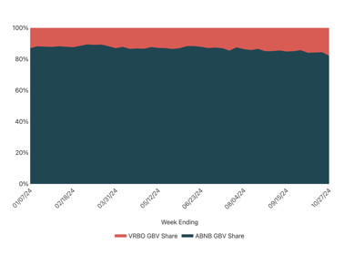
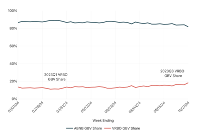
Area Chart Examples#
See below for common area chart options to use when creating visualizations.
Axes Customization Examples#
See below for common options to style axes. Axis can be adjusted for tick positioning and number formatting.
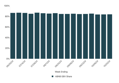
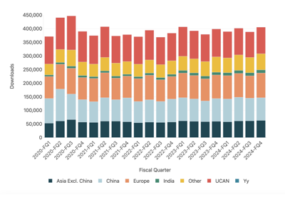
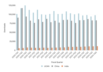
Bar Chart Examples#
See below for common bar chart options to use when creating visualizations.
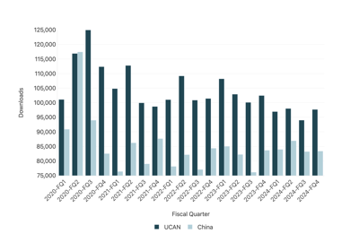
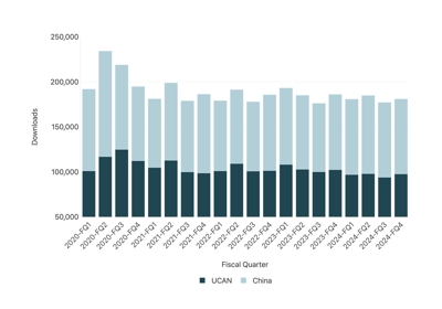
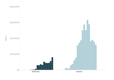
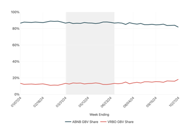
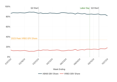
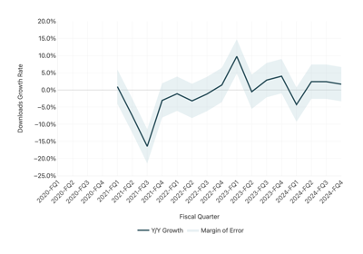
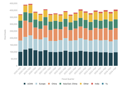
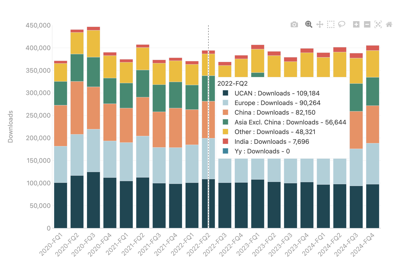
Chart Context Examples#
See below for examples of modifying charts to convey context such as annotations or shaded regions.
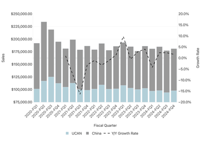
Combo Chart Examples#
See below for combo chart options to use when creating visualizations. Combo charts are a mix of lines or bar charts.
Heatmap Chart Examples#
See below for examples of creating heatmap visualizations

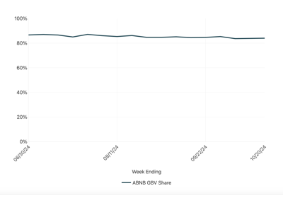
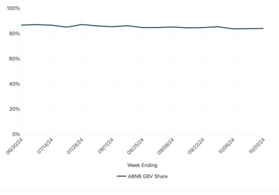
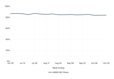
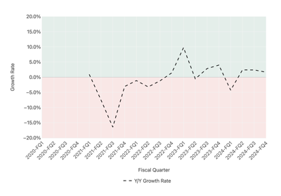
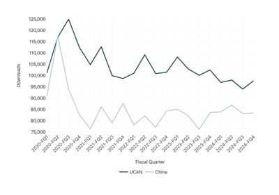
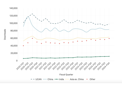
Line Chart Examples#
See below for common line chart options to use when creating visualizations.
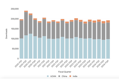
Pivot Chart Examples#
See below for options to pivot charts based on data with multiple categories that need to be plotted individually.
Styling Chart Examples#
See below for options to change overall styles for charts
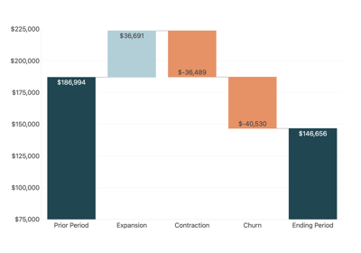
Waterfall Chart Examples#
See below for examples to create a waterfall (bridge) chart