Ctrl+K
Visualization Toolkit - Library to create high quality and interactive data visualizations - Home
  • plotly module
  • theme module
  • dash module
  • chart recipes
  • GitHub
  • plotly module
  • theme module
  • dash module
  • chart recipes
  • GitHub
  • chart recipes
  • Axes...

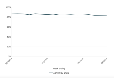
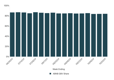
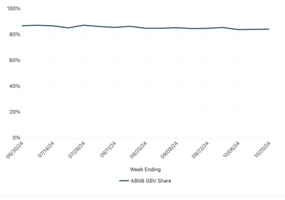
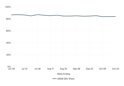
Axes Customization Examples#

See below for common options to style axes. Axis can be adjusted for tick positioning and number formatting.

Truncate X-axis and Y-Axis

Truncate X-axis and Y-Axis

Date Axis for Bar Charts

Date Axis for Bar Charts

Set Date Axis Intervals

Set Date Axis Intervals

Specify Date Axis Tick Formats

Specify Date Axis Tick Formats

Numerical axis formatting and intervals

Numerical axis formatting and intervals

previous

Basic Area Chart

next

Truncate X-axis and Y-Axis

Show Source

© Copyright 2024, YipitData.

Created using Sphinx 7.3.7.

Built with the PyData Sphinx Theme 0.15.4.