Ctrl+K
Visualization Toolkit - Library to create high quality and interactive data visualizations - Home
  • plotly module
  • theme module
  • dash module
  • chart recipes
  • GitHub
  • plotly module
  • theme module
  • dash module
  • chart recipes
  • GitHub
  • chart recipes
  • Chart...

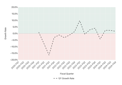
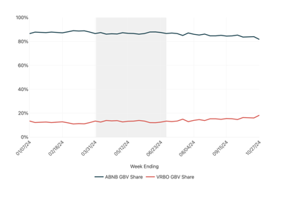
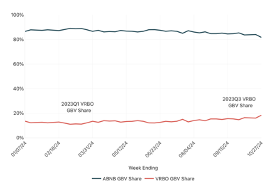
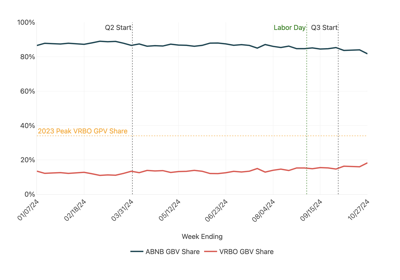
Chart Context Examples#

See below for examples of modifying charts to convey context such as annotations or shaded regions.

Shade Positive and Negative Regions

Shade Positive and Negative Regions

Shaded Regions

Shaded Regions

Chart Floating Annotations

Chart Floating Annotations

Chart Annotations

Chart Annotations

previous

Clustered Bar Chart

next

Shade Positive and Negative Regions

Show Source

© Copyright 2024, YipitData.

Created using Sphinx 7.3.7.

Built with the PyData Sphinx Theme 0.15.4.